Octagon Logistics – Branding Identity Proposal
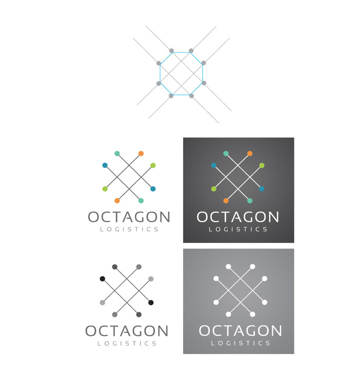
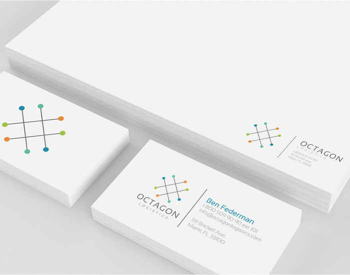
Brand Identity Proposal for Octagon Logistics designed by Studio Uni. The challenge here was to make a new logo that could still be related back to their parent company Octagon Commerce. The problem was resolve by using the same color palette and fonts. The mark symbolizes movement from point A to point B, which describes the service the logistics company will provide. Also, connecting all the dots completes an octagon shape keeping the logos concept linked to its name.


